
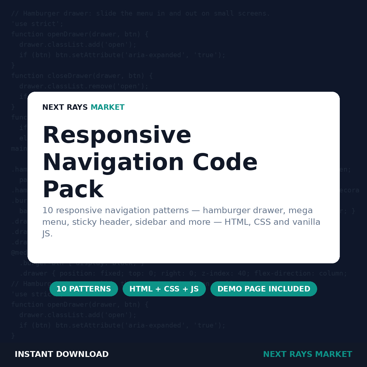
Responsive Navigation Code Pack
$12.00
10 responsive navigation patterns — hamburger drawer, mega menu, sticky header, sidebar and more — HTML, CSS and vanilla JS.
Description
Navigation is the part of a site every visitor touches, and the part most often done badly on mobile. This pack gives you 10 responsive navigation patterns — from a simple top bar to a fullscreen overlay menu — each as clean HTML, CSS and vanilla JavaScript you can drop into your own site. WHO IT’S FOR: Front-end developers building site navigation for websites, landing pages and web apps. WHAT’S INSIDE: 10 patterns: top bar, hamburger drawer, mega menu, sticky header, sidebar, tabs bar, bottom mobile bar, breadcrumbs bar, dropdown menu and fullscreen overlay. Each pattern as its own folder with index.html, style.css and script.js. A demo HTML page showing all 10 patterns. A Node test suite that checks the JavaScript logic of every pattern. A usage guide (PDF) and a README. HOW TO USE IT: Copy a pattern’s HTML, CSS and JS into your page, change the links and labels, and adjust the breakpoint in the CSS to match your design. Open the demo page to compare all 10 patterns side by side. HONEST NOTE: The JavaScript logic was tested in Node; visual rendering was not tested in every browser. Resize your browser window to see each pattern respond. LICENCE: Personal Use — one buyer, unlimited personal prints/copies; no resale, no redistribution, no sharing of files. You may use the code in your own projects. The files themselves may not be resold, redistributed or shared as a pack.


Reviews
There are no reviews yet.